
Scikit-learn Visualization Guide: Making Models Speak
Use the Display API to replace complex Matplotlib code

Introduction
In the journey of machine learning, explaining models with visualization is as important as training them.
A good chart can show us what a model is doing in an easy-to-understand way. Here's an example:
This graph makes it clear that for the same dataset, the model on the right is better at generalizing.
Most machine learning books prefer to use raw Matplotlib code for visualization, which leads to issues:
- You have to learn a lot about drawing with Matplotlib.
- Plotting code fills up your notebook, making it hard to read.
- Sometimes you need third-party libraries, which isn't ideal in business settings.
Good news! Scikit-learn now offers Display classes that let us use methods like from_estimator and from_predictions to make drawing graphs for different situations much easier.
Curious? Let me show you these cool APIs.
Scikit-learn Display API Introduction
Use utils.discovery.all_displays to find available APIs
Scikit-learn (sklearn) always adds Display APIs in new releases, so it's key to know what's available in your version.
Sklearn's utils.discovery.all_displays lets you see which classes you can use.
from sklearn.utils.discovery import all_displays

displays = all_displays()
displays
For example, in my Scikit-learn 1.4.0, these classes are available:
[('CalibrationDisplay', sklearn.calibration.CalibrationDisplay),
 ('ConfusionMatrixDisplay',
  sklearn.metrics._plot.confusion_matrix.ConfusionMatrixDisplay),
 ('DecisionBoundaryDisplay',
  sklearn.inspection._plot.decision_boundary.DecisionBoundaryDisplay),
 ('DetCurveDisplay', sklearn.metrics._plot.det_curve.DetCurveDisplay),
 ('LearningCurveDisplay', sklearn.model_selection._plot.LearningCurveDisplay),
 ('PartialDependenceDisplay',
  sklearn.inspection._plot.partial_dependence.PartialDependenceDisplay),
 ('PrecisionRecallDisplay',
  sklearn.metrics._plot.precision_recall_curve.PrecisionRecallDisplay),
 ('PredictionErrorDisplay',
  sklearn.metrics._plot.regression.PredictionErrorDisplay),
 ('RocCurveDisplay', sklearn.metrics._plot.roc_curve.RocCurveDisplay),
 ('ValidationCurveDisplay',
  sklearn.model_selection._plot.ValidationCurveDisplay)]
Using inspection.DecisionBoundaryDisplay for decision boundaries
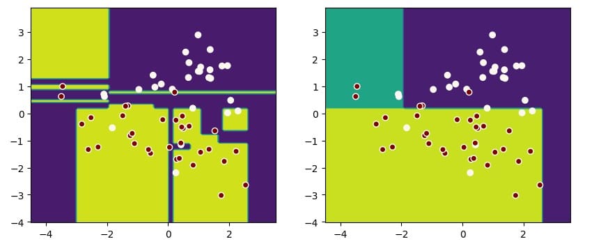
Since we mentioned it, let's start with decision boundaries.
If you use Matplotlib to draw them, it's a hassle:
- Use
np.linspaceto set coordinate ranges; - Use
plt.meshgridto calculate the grid; - Use
plt.contourfto draw the decision boundary fill; - Then use
plt.scatterto plot data points.
Now, with inspection.DecisionBoundaryDisplay, you can simplify this process:
from sklearn.inspection import DecisionBoundaryDisplay
from sklearn.datasets import load_iris
from sklearn.svm import SVC
from sklearn.pipeline import make_pipeline
from sklearn.preprocessing import StandardScaler
import matplotlib.pyplot as plt

iris = load_iris(as_frame=True)
X = iris.data[['petal length (cm)', 'petal width (cm)']]
y = iris.target


svc_clf = make_pipeline(StandardScaler(),
                        SVC(kernel='linear', C=1))
svc_clf.fit(X, y)

display = DecisionBoundaryDisplay.from_estimator(svc_clf, X,
                                                 grid_resolution=1000,
                                                 xlabel="Petal length (cm)",
                                                 ylabel="Petal width (cm)")
plt.scatter(X.iloc[:, 0], X.iloc[:, 1], c=y, edgecolors='w')
plt.title("Decision Boundary")
plt.show()
See the final effect in the figure:
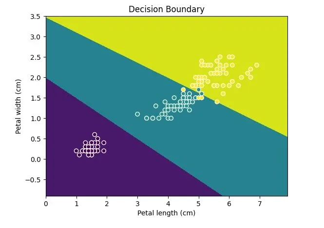
Remember, Display can only draw 2D, so make sure your data has only two features or reduced dimensions.
Using calibration.CalibrationDisplay for probability calibration
When your classification model outputs predictions as probabilities, you can use a probability calibration curve to show how well the predicted probabilities match the actual probabilities.
For a perfect classification model, its calibration curve will follow a 45-degree line, meaning the predicted probabilities are consistent with the actual probabilities.
Note that CalibrationDisplay uses the model's predict_proba. If you use a support vector machine, set probability to True:
from sklearn.calibration import CalibrationDisplay
from sklearn.model_selection import train_test_split
from sklearn.datasets import make_classification
from sklearn.ensemble import HistGradientBoostingClassifier

X, y = make_classification(n_samples=1000,
                           n_classes=2, n_features=5,
                           random_state=42)
X_train, X_test, y_train, y_test = train_test_split(X, y,
                                                    test_size=0.3, random_state=42)
proba_clf = make_pipeline(StandardScaler(),
                          SVC(kernel="rbf", gamma="auto",
                              C=10, probability=True))
proba_clf.fit(X_train, y_train)

CalibrationDisplay.from_estimator(proba_clf,
                                            X_test, y_test)

hist_clf = HistGradientBoostingClassifier()
hist_clf.fit(X_train, y_train)

ax = plt.gca()
CalibrationDisplay.from_estimator(hist_clf,
                                  X_test, y_test,
                                  ax=ax)
plt.show()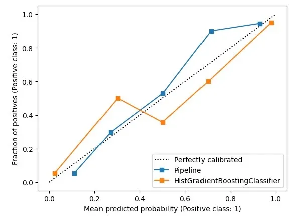
Using metrics.ConfusionMatrixDisplay for confusion matrices
When assessing classification models and dealing with imbalanced data, we look at precision and recall.
These break down into TP, FP, TN, and FN – a confusion matrix.
To draw one, use metrics.ConfusionMatrixDisplay. It's well-known, so I'll skip the details.
from sklearn.datasets import fetch_openml
from sklearn.ensemble import RandomForestClassifier
from sklearn.metrics import ConfusionMatrixDisplay

digits = fetch_openml('mnist_784', version=1)
X, y = digits.data, digits.target
rf_clf = RandomForestClassifier(max_depth=5, random_state=42)
rf_clf.fit(X, y)

ConfusionMatrixDisplay.from_estimator(rf_clf, X, y)
plt.show()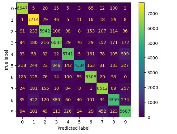
metrics.RocCurveDisplay and metrics.DetCurveDisplay
These two are together because they're often used to evaluate side by side.
RocCurveDisplay compares TPR and FPR for the model.
For binary classification, you want low FPR and high TPR, so the upper left corner is best. The Roc curve bends towards this corner.
Because the Roc curve stays near the upper left, leaving the lower right empty, it's hard to see model differences.
So, we also use DetCurveDisplay to draw a Det curve with FNR and FPR. It uses more space, making it clearer than the Roc curve.
The perfect point for a Det curve is the lower left corner.
from sklearn.metrics import RocCurveDisplay
from sklearn.metrics import DetCurveDisplay

X, y = make_classification(n_samples=10_000, n_features=5,
                           n_classes=2, n_informative=2)
X_train, X_test, y_train, y_test = train_test_split(X, y,
                                                    test_size=0.3, random_state=42,
                                                    stratify=y)


classifiers = {
    "SVC": make_pipeline(StandardScaler(), SVC(kernel="linear", C=0.1, random_state=42)),
    "Random Forest": RandomForestClassifier(max_depth=5, random_state=42)
}

fig, [ax_roc, ax_det] = plt.subplots(1, 2, figsize=(10, 4))
for name, clf in classifiers.items():
    clf.fit(X_train, y_train)

    RocCurveDisplay.from_estimator(clf, X_test, y_test, ax=ax_roc, name=name)
    DetCurveDisplay.from_estimator(clf, X_test, y_test, ax=ax_det, name=name)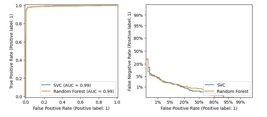
Using metrics.PrecisionRecallDisplay to adjust thresholds
With imbalanced data, you might want to shift recall and precision.
- For email fraud, you want high precision.
- For disease screening, you want high recall to catch more cases.
You can adjust the threshold, but what's the right amount?
Here, metrics.PrecisionRecallDisplay can help.
from xgboost import XGBClassifier
from sklearn.datasets import load_wine
from sklearn.metrics import PrecisionRecallDisplay

wine = load_wine()
X, y = wine.data[wine.target<=1], wine.target[wine.target<=1]
X_train, X_test, y_train, y_test = train_test_split(X, y, test_size=0.3,
                                                    stratify=y, random_state=42)

xgb_clf = XGBClassifier()
xgb_clf.fit(X_train, y_train)

PrecisionRecallDisplay.from_estimator(xgb_clf, X_test, y_test)
plt.show()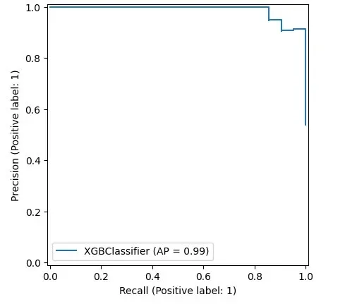
This shows that models following Scikit-learn's design can be drawn, like xgboost here. Handy, right?
Using metrics.PredictionErrorDisplay for regression models
We've talked about classification, now let's talk about regression.
Scikit-learn's metrics.PredictionErrorDisplay helps assess regression models.
from sklearn.svm import SVR
from sklearn.metrics import PredictionErrorDisplay

rng = np.random.default_rng(42)
X = rng.random(size=(200, 2)) * 10
y = X[:, 0]**2 + 5 * X[:, 1] + 10 + rng.normal(loc=0.0, scale=0.1, size=(200,))

reg = make_pipeline(StandardScaler(), SVR(kernel='linear', C=10))
reg.fit(X, y)

fig, axes = plt.subplots(1, 2, figsize=(8, 4))
PredictionErrorDisplay.from_estimator(reg, X, y, ax=axes[0], kind="actual_vs_predicted")
PredictionErrorDisplay.from_estimator(reg, X, y, ax=axes[1], kind="residual_vs_predicted")
plt.show()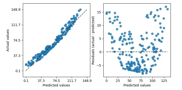
As shown, it can draw two kinds of graphs. The left shows predicted vs. actual values – good for linear regression.
However, not all data is perfectly linear. For that, use the right graph.
It compares real vs. predicted differences, a residuals plot.
This plot's banana shape suggests our data might not fit linear regression.
Switching from a linear to an rbf kernel can help.
reg = make_pipeline(StandardScaler(), SVR(kernel='rbf', C=10))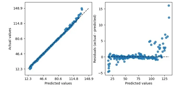
See, with rbf, the residual plot looks better.
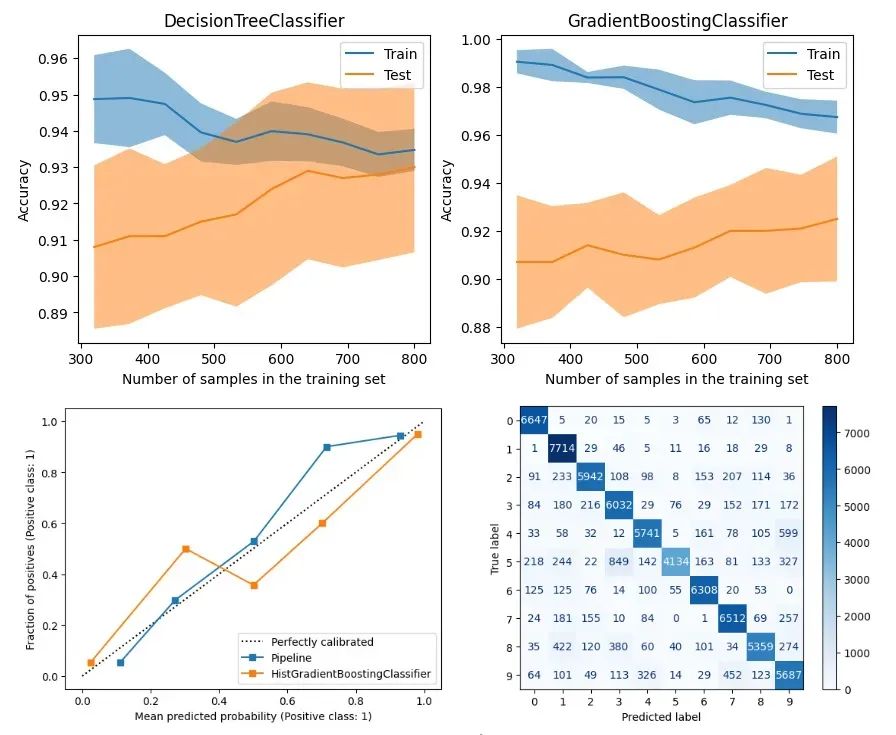
Using model_selection.LearningCurveDisplay for learning curves
After assessing performance, let's look at optimization with LearningCurveDisplay.
First up, learning curves – how well the model generalizes with different training and testing data, and if it suffers from variance or bias.
As shown below, we compare a DecisionTreeClassifier and a GradientBoostingClassifier to see how they do as training data changes.
from sklearn.tree import DecisionTreeClassifier
from sklearn.ensemble import GradientBoostingClassifier
from sklearn.model_selection import LearningCurveDisplay

X, y = make_classification(n_samples=1000, n_classes=2, n_features=10,
                           n_informative=2, n_redundant=0, n_repeated=0)

tree_clf = DecisionTreeClassifier(max_depth=3, random_state=42)
gb_clf = GradientBoostingClassifier(n_estimators=50, max_depth=3, tol=1e-3)

train_sizes = np.linspace(0.4, 1.0, 10)
fig, axes = plt.subplots(1, 2, figsize=(10, 4))
LearningCurveDisplay.from_estimator(tree_clf, X, y,
                                    train_sizes=train_sizes,
                                    ax=axes[0],
                                    scoring='accuracy')
axes[0].set_title('DecisionTreeClassifier')
LearningCurveDisplay.from_estimator(gb_clf, X, y,
                                    train_sizes=train_sizes,
                                    ax=axes[1],
                                    scoring='accuracy')
axes[1].set_title('GradientBoostingClassifier')
plt.show()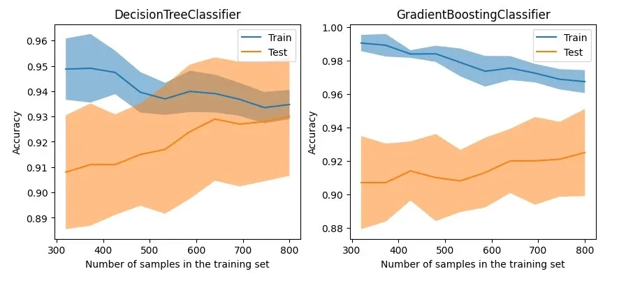
The graph shows that although the tree-based GradientBoostingClassifier maintains good accuracy on the training data, its generalization capability on test data does not have a significant advantage over the DecisionTreeClassifier.
Using model_selection.ValidationCurveDisplay for visualizing parameter tuning
So, for models that don't generalize well, you might try adjusting the model's regularization parameters to tweak its performance.
The traditional approach is to use tools like GridSearchCV or Optuna to tune the model, but these methods only give you the overall best-performing model and the tuning process is not very intuitive.
For scenarios where you want to adjust a specific parameter to test its effect on the model, I recommend using model_selection.ValidationCurveDisplay to visualize how the model performs as the parameter changes.
from sklearn.model_selection import ValidationCurveDisplay
from sklearn.linear_model import LogisticRegression

param_name, param_range = "C", np.logspace(-8, 3, 10)
lr_clf = LogisticRegression()

ValidationCurveDisplay.from_estimator(lr_clf, X, y,
                                      param_name=param_name,
                                      param_range=param_range,
                                      scoring='f1_weighted',
                                      cv=5, n_jobs=-1)
plt.show()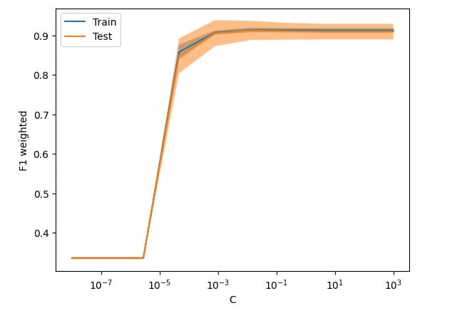
Some regrets
After trying out all these Displays, I must admit some regrets:
- The biggest one is that most of these APIs lack detailed tutorials, which is probably why they're not well-known compared to Scikit-learn's thorough documentation.
- These APIs are scattered across various packages, making it hard to reference them from a single place.
- The code is still pretty basic. You often need to pair it with Matplotlib's APIs to get the job done. A typical example is
DecisionBoundaryDisplay, where after plotting the decision boundary, you still need Matplotlib to plot the data distribution. - They're hard to extend. Besides a few methods validating parameters, it's tough to simplify my model visualization process with tools or methods; I end up rewriting a lot.
I hope these APIs get more attention, and as versions upgrade, visualization APIs become even easier to use.
Conclusion
In the journey of machine learning, explaining models with visualization is as important as training them.
This article introduced various plotting APIs in the current version of scikit-learn.
With these APIs, you can simplify some Matplotlib code, ease your learning curve, and streamline your model evaluation process.
Due to length, I didn't expand on each API. If interested, you can check the official documentation for more details.
Now it's your turn. What are your expectations for visualizing machine learning methods? Feel free to leave a comment and discuss.