
Seaborn 0.12: An Insightful Guide to the Objects Interface and Declarative Graphics
Streamlining your data visualization journey with Python's popular library


This article aims to introduce the objects interface feature in Seaborn 0.12, including the concept of declarative graphic syntax, and a practical visualization project to showcase the usage of the objects interface.
By the end of this article, you'll have a clear understanding of the advantages and limitations of Seaborn's objects interface API. And you will be able to use Seaborn for data analysis projects more easily.
Introduction
Imagine you're creating a data visualization chart using Python.
You have to instruct the computer every step of the way: select a dataset, create a figure, set the color, add labels, adjust the size, etc...
Then you realize your code is getting longer and more complex, and all you wanted was to quickly visualize your data.
It's like going to the grocery store and having to specify every item's location, color, size, and shape, instead of just telling the shop assistant what you need.
Not only is this time-consuming, but it can also feel tiring.
However, Seaborn 0.12's new feature—the objects interface—and its use of declarative graphic syntax is like having a shop assistant who understands you. You just need to tell it what you need to do, and it will find everything for you.
You no longer need to instruct it every step of the way. You just need to tell it what kind of result you want.
In this article, I'll guide you through using the objects interface, this new feature that makes your data visualization process more effortless, flexible, and enjoyable. Let's get started!
Seaborn API: Then and Now
Before diving into the objects interface API, let's systematically look at the differences between the Seaborn API of earlier versions and the 0.12 version.
The original API
Many readers might have been intimidated by Matplotlib's complex API documentation when learning Python data visualization.
Seaborn simplifies this by wrapping and streamlining Matplotlib's API, making the learning curve gentler.
Seaborn doesn't just offer high-level encapsulation of Matplotlib; it also categorizes all charts into relational, distributional, and categorical scenarios.
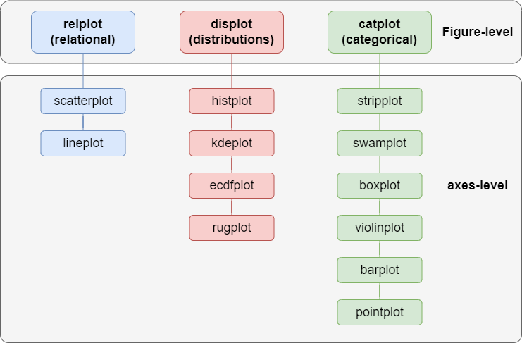
You should comprehensively understand Seaborn's API through this diagram and know when to use which chart.
For example, a histplot representing data distribution would fall under the distribution chart category.
In contrast, a violinplot representing data features by category would be classified as a categorical chart.
Aside from vertical categorization, Seaborn also performs horizontal categorization: Figure-level and axes-level.
According to the official website, axes-level charts are drawn on matplotlib.pyplot.axes and can only draw one figure.
In contrast, Figure-level charts use Matplotlib's FacetGrid to draw multiple charts in one figure, facilitating easy comparison of similar data dimensions.
However, even though Seaborn's API significantly simplifies chart drawing through encapsulating Matplotlib, creating an individual-specific chart still requires complex configurations.
For example, if I use Seaborn's built-in penguins dataset to draw a histplot, the code is as follows:
sns.histplot(penguins, x="flipper_length_mm", hue="species");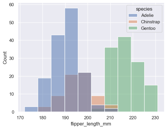
And when I use the same dataset to draw a kdeplot, the code is as follows:
sns.kdeplot(penguins, x="flipper_length_mm", fill=True, hue="species");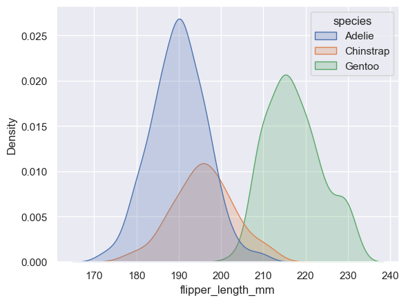
Except for the chart API, the rest of the configurations are identical.
This is like telling the chef I want to use lamb chops and onions to make a lamb soup and specifying the cooking steps. When I want to use these ingredients to make a roasted lamb chop, I have to tell the chef about the ingredients and the cooking steps all over again.
Not only is it inefficient, but it also needs more flexibility.
That's why Seaborn introduced the objects interface API in its 0.12 version. This declarative graphic syntax dramatically improves the process of creating a chart.
The objects Interface API
Before we start with the objects interface API, let's take a high-level look at it to better understand the drawing process.
Unlike the original Seaborn API, which organizes the drawing API by classification, the objects interface API collects the API by a drawing pipeline.
The objects interface API divides the drawing into multiple stages, such as data binding, layout, presentation, customization, etc.
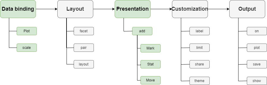
The data binding and presentation stages are necessary, while other stages are optional.
Also, since the stages are independent, each stage can be reused. Following the previous example of the hist and kde plots:
To use the objects interface to draw, we first need to bind the data:
p = so.Plot(penguins, x="flipper_length_mm", color="species")From this line of code, we can see that the objects interface uses the so.Plot class for data binding.
Also, compared to the original API that uses the incomprehensible hue parameter, it uses the color parameter to bind the species dimension directly to the chart color, making the configuration more intuitive.
Finally, this line of code returns a p instance that can be reused to draw a chart.
Next, let's draw a histplot:
p.add(so.Bars(), so.Hist())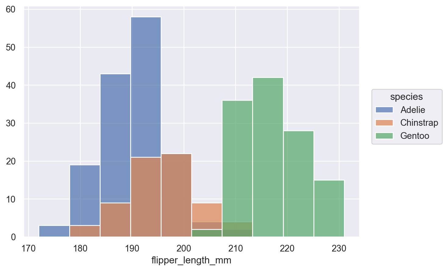
This line of code shows that the drawing stage does not need to rebind the data. We just need to tell the add method what to draw: so.Bars(), and how to calculate it: so.Hist().
The add method also returns a copy of the Plot instance, so any adjustments in the add method will not affect the original data binding. The p instance can still be reused.
Therefore, we continue to call the p.add() method to draw a kdeplot:
p.add(so.Area(), so.KDE())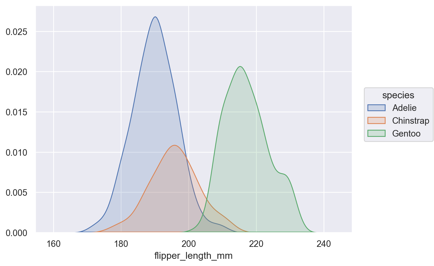
Since KDE is a way of statistic, so.KDE() is called on the stat parameter here. And since the kdeplot itself is an area plot, so.Area() is used for drawing.
We reused the p instance bound to the data, so there is no need to tell the chef how to cook each dish, but to directly say what we want. Isn't it much more concise and flexible?
Unpacking the Objects Interface with Examples
Next, see how some common charts are written using the original Seaborn API and the objects interface API.
Before we start, we need to import the necessary libraries:
%matplotlib inline

import matplotlib.pyplot as plt
import seaborn as sns
import seaborn.objects as so

import pandas as pd

sns.set()
penguins = sns.load_dataset('penguins')
Bar chart
In the original API, to draw a bar chart, the code is as follows:
sns.barplot(penguins, x="island", y="body_mass_g", hue="species");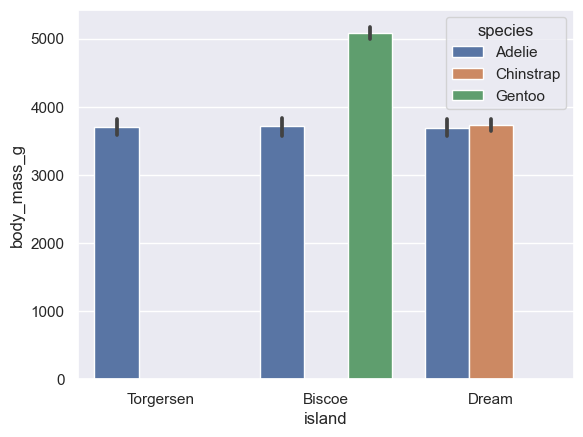
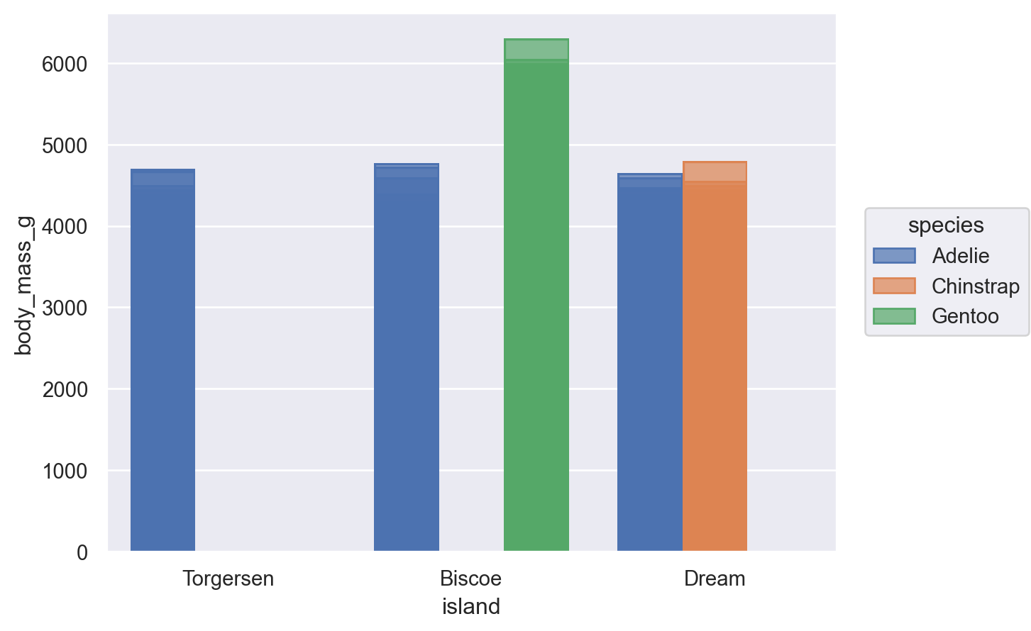
In the objects interface, to draw a bar chart, the code is as follows:
(
    so.Plot(penguins, x="island", y="body_mass_g", color="species")
    .add(so.Bar(), so.Dodge())
)
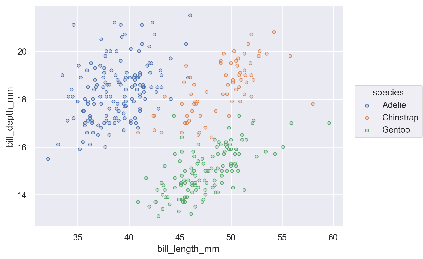
Scatter plot
In the original API, to draw a scatter plot, the code is as follows:
sns.relplot(penguins, x="bill_length_mm", y="bill_depth_mm", hue="species");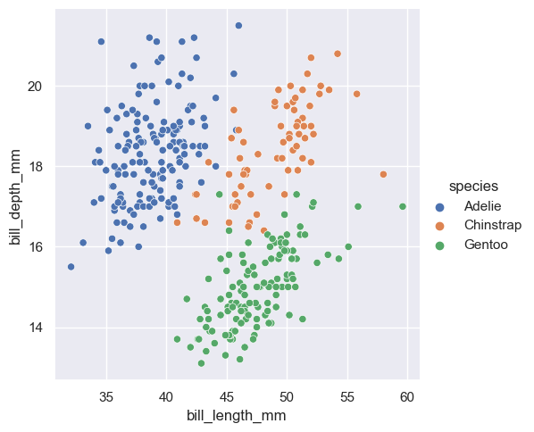
In the objects interface, to draw a scatter plot, the code is as follows:
(
    so.Plot(penguins, x="bill_length_mm", y="bill_depth_mm", color="species")
    .add(so.Dots())
)
You may think that after comparing the drawing of the two APIs, it doesn't seem like the objects interface is too special either.
Don't worry. Let's take a look at the advanced usage of the objects interface.
Advanced usage
Suppose we use Seaborn's tips dataset.
tips = sns.load_dataset("tips")I want to use a bar chart to see the average tip for different dates and mark the values on the chart.
The chart I want is shown below:
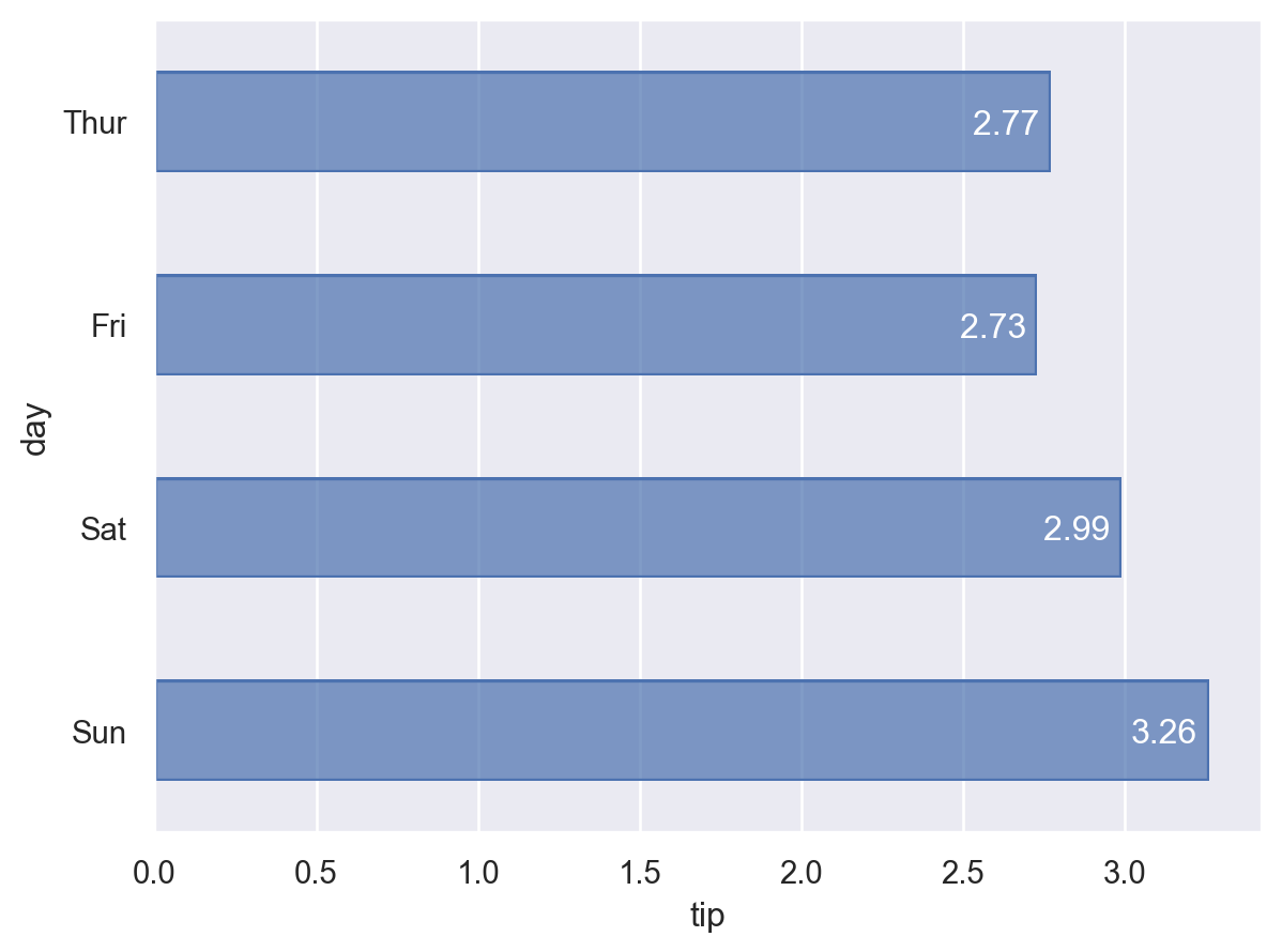
Before we start drawing, we need to process the tips dataset to calculate the average value for each day.
day_mean = tips[['day', 'tip']].groupby('day').mean().round(2).reset_index()
Then, we can use the objects interface to draw:
(
    day_mean
    .pipe(so.Plot, y="day", x="tip", text="tip")
    .add(so.Bar(width=.5))
    .add(so.Text(color='w', halign="right"))
)
We use two tricks here:
First, we call the pipe method on the dataframe to enable chain code calls.
Second, we can reuse the instance of so.Plot, and only bind the data once to draw multiple graphs.
Then, let's see how the code would be written using the original API:
ax = sns.barplot(day_mean, x="tip", y="day")

for p in ax.patches:
    width = p.get_width()
    ax.text(width,
            p.get_y() + p.get_height()/2,
            '{:1.2f}'.format(width),
            ha="right", va="center")
plt.show()
As you can see, the original code is much more complex:
First, draw a horizontal bar chart.
Then use iteration to draw the corresponding values on each bar.
In comparison, doesn't the objects interface seem simpler and more flexible?
Applying the Objects Interface to Real-World Data
Next, to help everyone deepen their memory and master the usage of the objects interface systematically, I plan to lead everyone to practice in an actual data visualization project.
In this project, I plan to visually explore the data of New York City's shared bicycle system to understand the usage of the city's shared bicycles and help enterprises operate better.
Data source
We will use the Citi Bike Sharing dataset from Citibikenyc in this project.
You can find the dataset here: https://citibikenyc.com/system-data
To facilitate the following coding process, I cleaned and merged the data in this dataset and finally synthesized one data set.
Data preprocessing
Before we begin, we should understand the fields included in this dataset, which can be achieved by executing the following code:
citibike = pd.read_csv("../data/CitiBike-2021-combined.csv", index_col="ID")
citibike.info()
Data columns (total 15 columns):
# Column Non-Null Count Dtype
--- ------ -------------- -----
0 Trip Duration 735502 non-null int64
1 Start Time 735502 non-null datetime64[ns]
2 Stop Time 735502 non-null datetime64[ns]
3 Start Station ID 735502 non-null int64
4 Start Station Name 735502 non-null object
5 Start Station Latitude 735502 non-null float64
6 Start Station Longitude 735502 non-null float64
7 End Station ID 735502 non-null int64
8 End Station Name 735502 non-null object
9 End Station Latitude 735502 non-null float64
10 End Station Longitude 735502 non-null float64
11 Bike ID 735502 non-null int64
12 User Type 735502 non-null object
13 Birth Year 735502 non-null int64
14 Gender 735502 non-null object
dtypes: datetime64[ns](2), float64(4), int64(8), object(6)
memory usage: 117.8+ MBThis dataset contains 15 fields, and since our goal is to understand the usage of shared bicycles in the city, all 15 fields will be helpful for us.
Also, to facilitate the analysis of the use of shared bicycles in different months of each year, as well as on weekdays and non-working days of each week, I need to generate two fields for the dataset: Start Month and Day Of Week:
citibike['Start Time'] = pd.to_datetime(citibike['Start Time'])
citibike['Stop Time'] = pd.to_datetime(citibike['Stop Time'])

citibike['Day Of Week'] = citibike['Start Time'].dt.day_of_week
citibike['Start Month'] = citibike['Start Time'].dt.month
day_dict = {0: 'Mon', 1: 'Tue', 2: 'Wen', 3: 'Thu', 4: 'Fri', 5: 'Sat', 6: 'Sun'}
citibike['Day Of Week'] = citibike['Day Of Week'].replace(day_dict)
To facilitate display, I will convert the Gender field into text gender, convert the Birth Year into Decade, and change Trip Duration from seconds to minutes:
citibike['Gender'] = citibike['Gender'].replace({0: 'Unknown', 1: 'Male', 2: 'Female'})
citibike['Decade'] = (citibike['Birth Year'] // 10 * 10).astype(str) + 's'
citibike['Duration_Min'] = citibike['Trip Duration'] // 60
Finally, since the original dataset is large, we only need to find out the distribution of the data, so I will sample the dataset for easier and faster drawing:
citibike_sample = citibike.sample(n=10000, random_state=1701)Visual analysis
Remember, the purpose of data visualization is not just to display data, but to excavate the story behind the data.
In this project, I expect to understand under what circumstances users will use shared bicycles, to facilitate the distribution of bicycles or carry out corresponding promotions.
First, I want to see in which season people are more inclined to use shared bicycles.
Since I want to see the total amount of data by month, I directly use the original dataset for drawing.
But to speed up the drawing, I aggregate the data in the dataframe and then call the pipeline using the pipe method.
(
    citibike.groupby('Start Month').size().reset_index(name="Count")
    .pipe(so.Plot, x="Start Month", y="Count")
    .add(so.Line(marker='o', edgecolor='w'))
    .add(so.Text(valign='bottom'), text='Count')
)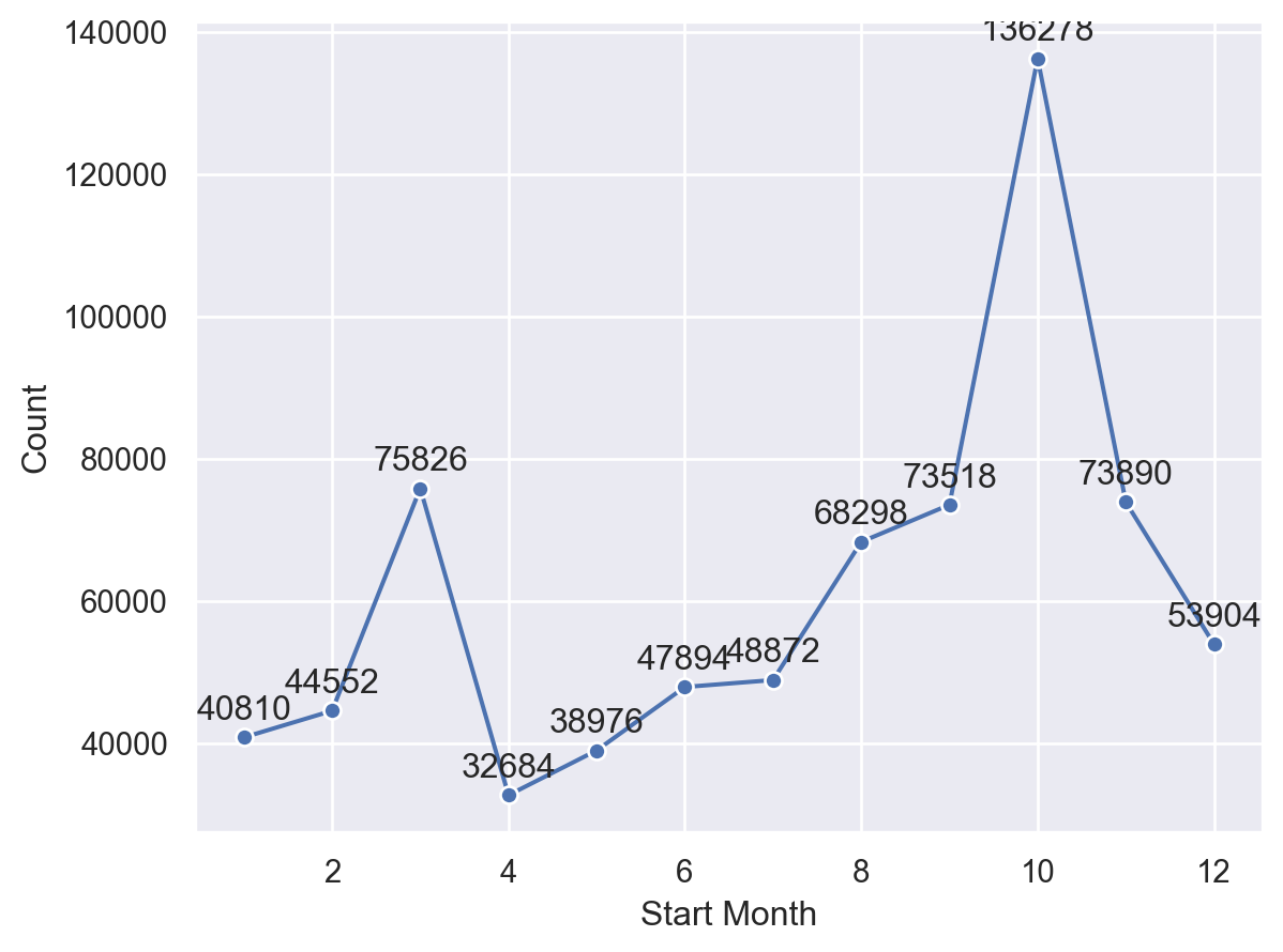
The chart shows that bicycles have more uses in March and October of each year. This indicates that people are more willing to ride bikes in a mild climate.
Next, I want to see which days of the week people use shared bicycles more.
Since we only need to see a proportion here, I use the sampled dataset and set a proportion in so.Hist().
(
    so.Plot(citibike_sample, x="Day Of Week", color="Gender")
    .scale(x=so.Nominal(order=['Mon', 'Tue', 'Wen', 'Thu', 'Fri', 'Sat', 'Sun']))
    .add(so.Bar(), so.Hist(stat="proportion"), so.Dodge())
)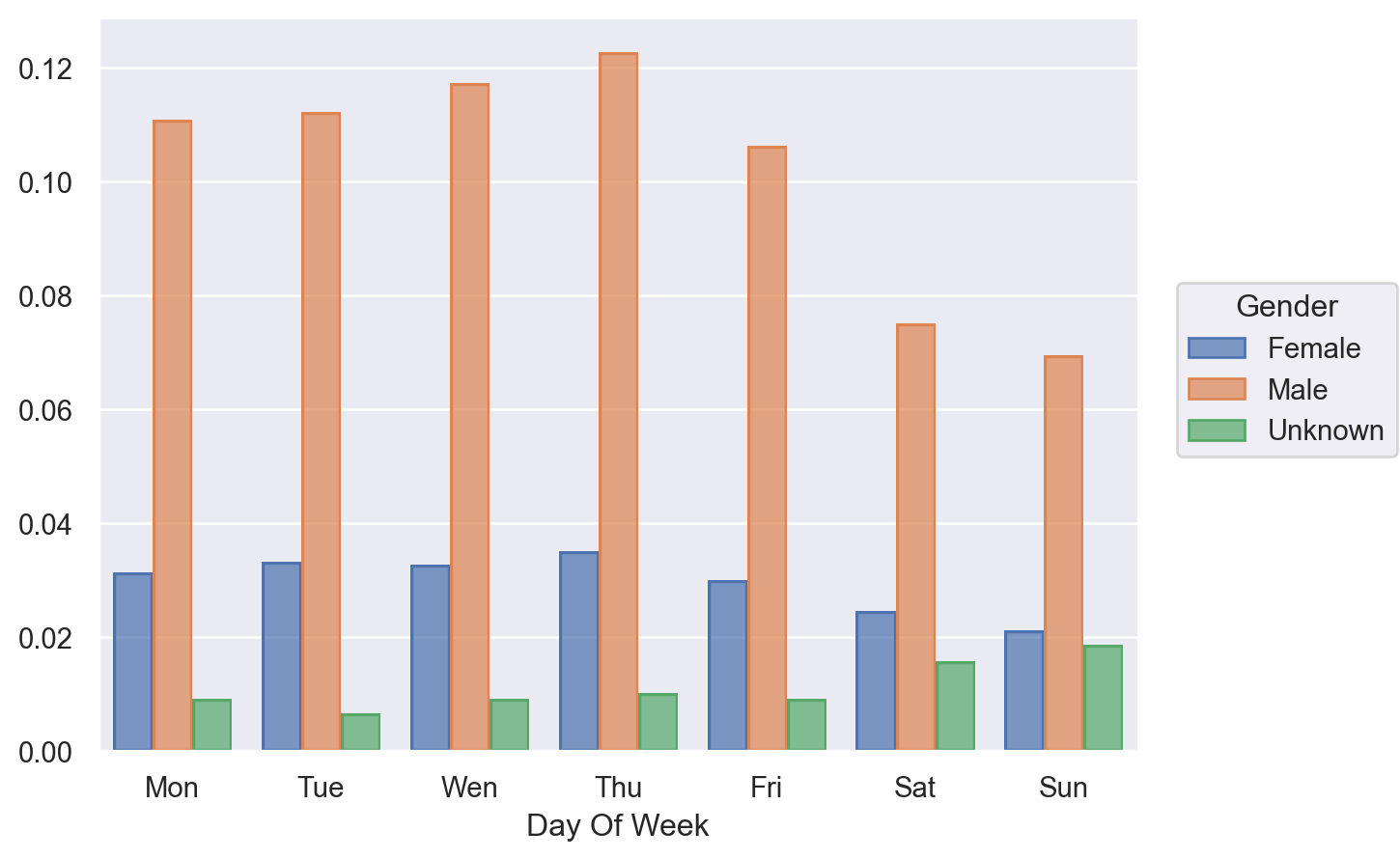
Both males and females use shared bicycles more on weekdays, probably for commuting to work.
But we also found that users with 'Unknown' gender use shared bicycles more on weekends.
Why is this the case? We can continue to explore.
Next, I want to see the proportion of cycling duration in different gender situations.
Here I will draw a histogram for each gender separately and use facet for layout.
To eliminate the interference generated by anomalous data, I only took data within one standard deviation of the average riding time for reference.
mean = citibike_sample["Duration_Min"].mean()
std = citibike_sample["Duration_Min"].std()
citibike_filterd = citibike_sample.query("(Duration_Min > @mean - @std) and (Duration_Min < @mean + @std)")

(
    so.Plot(citibike_filterd, x="Duration_Min")
    .facet(col="Gender")
    .layout(size=(6,3))
    .add(so.Bars(), so.Hist(stat="proportion"))
)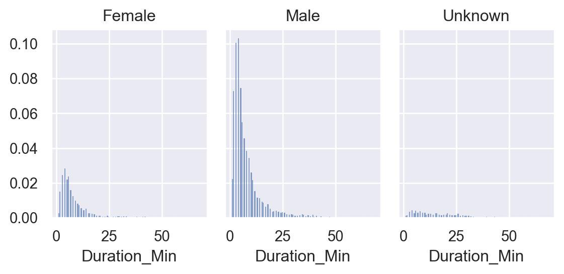
The chart shows that the cycling duration of males and females conforms to our cognition.
Still, the cycling duration of users with the 'Unknown' gender seems more evenly distributed, indicating that cycling is more casual and lacks purpose.
Fourth, I want to understand the proportion of cycling duration by membership category:
(
    so.Plot(citibike_filterd, x="Duration_Min")
    .facet(col="Gender", row="User Type")
    .share(y=False)
    .add(so.Bars(), so.Hist(stat="proportion"))
)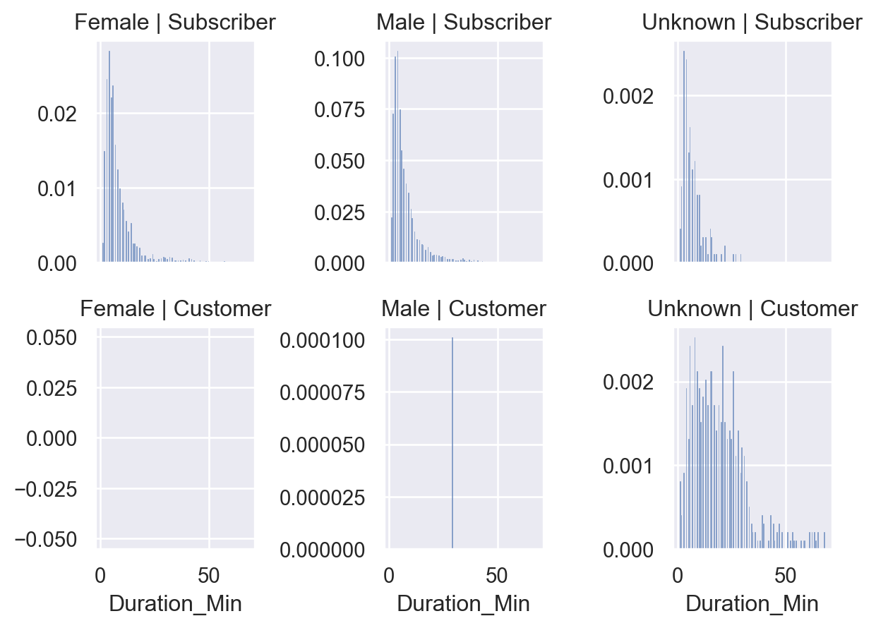
From the chart, we can see that for member users, regardless of gender, the distribution of cycling duration is more purposeful, tending to short-term cycling to quickly reach their destination.
For ordinary users, users with 'Unknown' gender have a more casual cycling duration and longer cycling times.
It seems that these users are there to temporarily get on their bikes and see the scenery?
Therefore, in the fifth step, I want to see the distribution of bicycle usage times between stations to verify my guess.
Since displaying so many stations on the chart can't be done, I first aggregate the sampled data by Start Station ID and End Station ID count.
start_end_station = citibike_sample.groupby(["Start Station ID", "End Station ID"]).size().reset_index(name="Count")Also, to avoid too many data points interfering with our analysis, I only took the data with the top 20% count for drawing.
p8 = start_end_station["Count"].quantile(.8)
start_end_filtered = start_end_station[start_end_station["Count"] >= p8]
Then use a scatter plot to plot the data and use the size of the point to represent the count size.
(
    so.Plot(start_end_filtered, x="Start Station ID", y="End Station ID", pointsize="Count", color="Count")
    .add(so.Dots())
)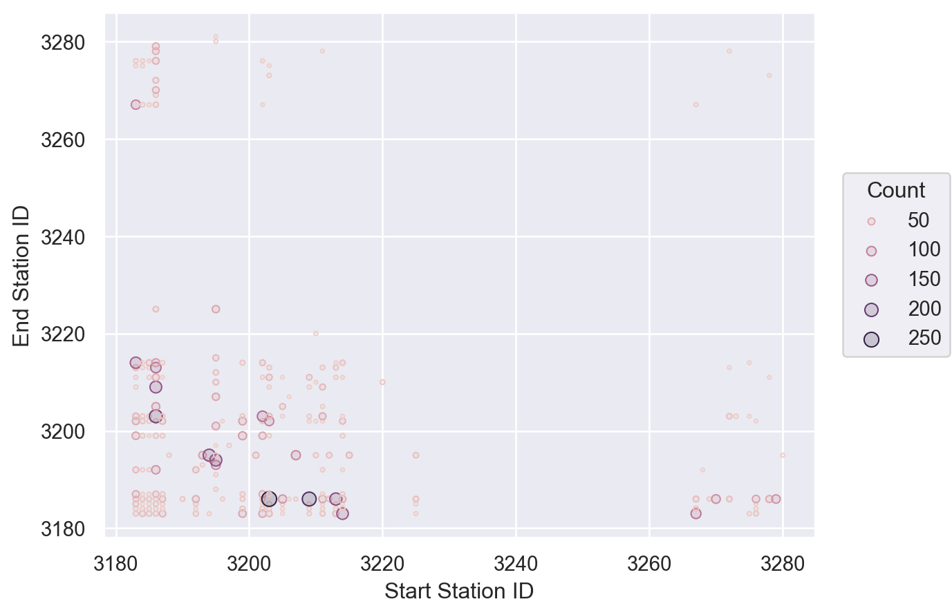
The chart shows that the number of rides is mainly distributed between stations with ID values of 3180 and 3220.
Compared with the table data, this area is concentrated for office workers.
There is also a lot of data distribution in the Station ID between 3260 and 3280.
By comparing the table data, we can see many parks and tourist attractions in this area.
This confirms our guess: in addition to office workers who tend to ride shared bicycles on weekdays, many tourists are willing to use shared bikes to go out and see the scenery on weekends.
Therefore, for this city's shared bicycle operation department, the operation strategy can not only discount on weekdays to attract members to ride more.
They can also use new user registration gifts or promote more attractions in the app on weekends to encourage tourists or temporary users to become member users.
Room for Growth: Current Limitations of Objects Interface
After demonstrating how the Seaborn objects interface helps us quickly perform data analysis in actual projects, I would like to discuss some improvements the objects interface needs to make based on my experience.
First, there needs to be more performance in the drawing.
As shown in the above project, when I use the original dataset to draw, the speed is languid, and Seaborn doesn't use the calculation ability of Numpy or Python Arrow.
Second, there needs to be more documentation.
So many APIs I can not find the specific use of the introduction, and I can only slowly fumble.
And the API design doesn’t feel very mature to me yet.
For example, I believe so.Stat and so.Move should be placed in the Data Mapping phase, but currently, they are placed in the Presentation phase through the add method, which needs to be revised.
Finally, the selection of charts needs to be more rich.
I initially planned to use pie charts and map charts in the city bike-sharing project, but I couldn't find them.
Although I could write an extension myself, that's a different story.
Also, when I want to layout the charts more complexly, I need to use Matplotlib's subplots API and integrate it with the on method, which still needs to be fully encapsulated.
Despite these shortcomings, I am confident about the future of Seaborn.
I think the team's choice of declarative graphical syntax has made Seaborn easier and more flexible to use.
I hope the Seaborn community will become more active in the near future.
Conclusion
In this article, I introduced the objects interface feature in Seaborn 0.12.
By introducing the benefits of declarative graphic syntax, I let you understand why the Seaborn team chose to evolve in this way.
Also, to cater to readers who need to become more familiar with Seaborn, I introduced the differences and similarities in API design philosophy between the original Seaborn and the objects interface version.
By taking you through an actual project analysis of city bike-sharing usage, you've seen first-hand how the objects interface API is used and my expectations for it.
Always remember, the goal of data visualization is not just to display data, but to uncover the stories behind the data.
I hope you found this article helpful. Feel free to comment and participate in the discussion if you have any questions or new ideas. I'm more than happy to answer your questions.